Friday, September 27, 2013

Etsy title tips: get your creation found

Something I point out a lot in the shop critiques team are title improvements. I've seen some etsians make titles sound like a really complicated effort, throwing around terms like "relevancy" and "optimization"... relax. Those are computer words. We are humans.

So all you need for a good listing title is this: use words that people will search for.

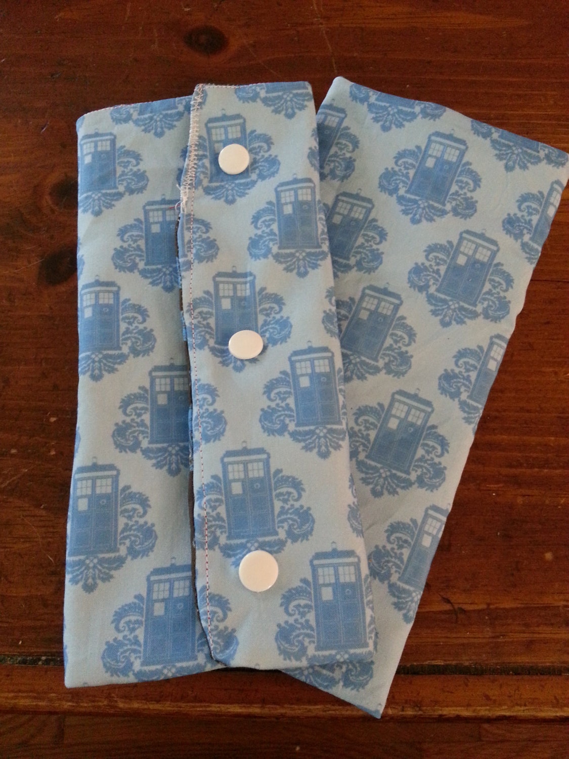
You hold your creation in your hand and you think "this is something I made with those extra zippers in my craft room"... that's what it is to you. But what is it to someone else? A blue purse. If someone wants a blue purse, you have JUST the item for them, don't you? So that's what you should use as the first words in your listing title!

A good thing to do is to use Etsy's search bar to see if people are actually searching for the stuff you're listing in your shop. For example if you type in "tote bag", all sorts of stuff comes up. Lots of people are searching for tote bags, there are even other suggestions, if you make a "chevron tote bag" you're really in luck. That would be a great phrase to start your title off with.


The most common mistake I see is shop owners who want to be descriptive and unique, so they scrape up some descriptive unique words. But shoppers don't think to use those words in search, so they're not helping you. If you type in a phrase and get no suggestions, it's probably not too common.


Etsy provides us with a very nice "shop statistics" page, where you can see what keywords are bringing in the most people to your shop. If you list five similar items, be sure to give them all a wide selection of titles and tags, and see what works best. Experiment and diversify! Maybe some people are searching for a "blue hat" and others are searching for a "wool hat" - if you've got two similar blue wool hats in your shop, give them different titles and you'll catch the eye of both sets of people.

Just remember that your target audience is always the people who come to Etsy with money in their pocket to buy something - that's who you want to find your item. Good titles are the most important tool you've got for that!

Tuesday, September 24, 2013

Survey of spoonflower colors - full saturation to black gradient

Spoonflower requires that designers order swatches of their designs before publishing. It's a good policy, because print often looks different than screen, especially with darker colors. Dark blue can easily wind up just being black. Subtle variations are often totally lost.

To help me out recently, I printed a swatch that crosses all hues, fading into black. Here was the original graphic I uploaded:


And here was the printed fabric on kona cotton:


I then made a "color averaged" version.


Now when I design my fabrics in GIMP, I have a two-layer file with my color averaged file on the top layer, "graphic" one underneath. I pick out what I want a color to look like using the color-averaged version, but "grab" the original version of it.

I plan to do some other gradients with this method... for example, I'm still trying to figure out how to get brown. Pastels are a lot easier on spoonflower, much more likely to come out looking like they do on the screen.

Thursday, September 19, 2013

My geeky baby onesie designs finished up by clichemom - yay!

A while back I introduced a collection on spoonflower of geeky baby onesie kits - cut and sew designs so you could sew up a onesie inspired by your favorite sci-fi show. Of course then what happened? I got Etsy convos from people wanting me to sew them up and sell them. Great, except I've got a full time job and just had another baby... no time!

Then I remembered heck, I'm on etsy! There are shops all over the place run by people looking for more sales, talented artists who can totally sew. I searched around and found someone who was already making geeky baby items, with snaps even... for me that was the most pain-in-the-rear part of the baby onesies, I hate closures. But my new friend Katie at clichemom has no problem with them.

So I convo'ed her to ask if I could send inquiries her way, she said sure, and we're off... she's fulfilling orders and giving me design feedback, I'm back to being just a fabric designer. Collaboration is awesome!

Here's what originally drew me to approach her, these adorable suck pads... basically little pads that snap around your baby carrier (bjorn, ergo, whatever pricy thing you've invested in) so your kid can drool all over the straps and you've got an easy removable bit to throw in the washer:

Blue fancy tardis suck padsBlue fancy tardis suck pads
by cichemom


And here are some of the onesies she's making with my fabric:

Little yellow trekkieLittle yellow trekkie
by cichemom


Little 10th time lord- 3-6 months sizeLittle 10th time lord- 3-6 months size
by cichemom


Little Wizard 3-6 months onesieLittle Wizard 3-6 months onesie
by cichemom


Saturday, September 14, 2013

mod podge cabinet door jewelry holder

Here's how I'm storing my necklaces these days:


Yes, I have a cute jewelry tree that sets on my dresser but my kid kept getting to it, so I came up with this solution, which is out of her reach!

1) Bought a 50 cent stick of wood at the hardware store
2) Painted it with mod podge, wrapped it with scrapbook paper, mod podged again
3) Stuck the ends to the door with command adhesive strips

Since my cabinet door is inset, I can just hang the necklaces over the stick.

Thursday, September 12, 2013

2013 trending color: flat brown

Earlier in the year pantone announced that emerald green was making a huge comeback and would totally be the color of 2013. This has proven to be total crap, which is a shame because it looks good on me, but seriously we're not seeing it anywhere. I'm not sure who emerald paid off at pantone to get such a nice prediction made out of it, but it didn't work.

No, the real trending colors for the year seem to be flat ones. Low saturation, neutral, relaxing, and homemade-looking. With that in mind, I've chosen a nice flat brown for my latest spoonflower fabric: geek glasses on flat brown


The color: #AB9073. I seriously compared a spoonflower color sample swatch to a chunk of cardboard. Don't laugh, I love it.

Here, I will put chevrons on it:


And this pattern I made over at colourlovers: