Thursday, July 11, 2013

Tutorial: Making a chevron pattern with GIMP

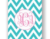
Chevrons are totally in right now and it's easy to make a tile-able background, but I gotta warn you this takes a crazy math skill (multiplication) so I've used my brains to step in and tell you how to do it! And as you all know my favorite graphics program is GIMP, but these basic guidelines will work anywhere.

Step 1: Make a striped background

Start a new image, whatever size you'd like, then give it some horizontal stripes. It works best if it's as wide or wider than it is tall.

My favorite method is to just set your background color as something pretty, select a stripe across your image with the rectangle select tool, and hit delete. Any stripe pattern will work!


I went to my favorite website for color palettes to find this fun combo, titled Cafe 1950 by áfrica*.

Tile & rotate

First, pay attention to the height of your image in pixels because you'll need to know that later. My image was 100 pixels high.

Now use Filters > Map > Tile and tile your image by at least 300%.


Rotate the image 45 degrees, using the rotate tool or hit ctrl+r


Crop

Now it's time to get your diagonal pattern to the right size, so it tiles seamlessly.

Remember your original image height? I hope so!

Go to Image > Canvas Size.

Get out your calculator! Multiply your original image height by the square root of 2... about 1.41. My original image was 100 pixels high so now I'm cropping it to 141x141.

Under "offset", just hit the center button.

And for "layers", use the "resize all layers" option.


Now you have a diagonal pattern that will tile seamlessly - you can go to Filters > Map > Tile to test it out!


Turn diagonal stripes into chevrons

But we were going for chevrons weren't we!

1) Layer > Duplicate layer
2) Filters > Map > Tile - now set the width only to tile to 200%
3) Layers > Stack > Layer to bottom


Now select your top layer in the list and flip it horizontally using the flip tool, or ctrl+h


Combine the layers using Image > Flatten Image.

And now you have one tiny part of your tile-able chevron pattern... use filters > map > tile to see how pretty it looks as a background!

Tuesday, July 9, 2013

Design your own baby onesie!

A few months ago I published my baby onesie pattern and I am here to announce that I've since had my baby, and it fit! I'll update the other post with pics.

Then I got the bright idea to use my template to design some simple cut-and-sew patterns for my favorite fabric printing website, Spoonflower. I made three new designs for my geek baby collection... simple patterns that you just cut out and sew up.

And I'm totally fine with you doing the same thing, so here's the image template I used. It's basically a .jpg version of the printable pdf pattern, scaled for 150 dpi printing. Download the image, design your onesie, upload it to spoonflower, and it will print a perfect pattern on a fat quarter of organic cotton knit.


Feel free to comment here with whatever unique designs you've made with it, I'd love to see where it goes! You're welcome to use this for commercial purposes, but if you want to throw me a little publicity that'd be nice :)

Sunday, July 7, 2013

Lots of views, no sales: Why Etsy promotion can hurt you

I know... you work hard on your art. It's nicely photographed. You want to tell someone about it so it's not just sitting out there lonely on the internet. So if you're like a lot of Etsy sellers you first turn to one of these places to quickly & easily broadcast your new listing to the world:

1) Your own social media pages - twitter, pinterest, facebook, your blog
2) An Etsy team with a "post your new item here" thread

But I'm going to recommend that you avoid all that, for a moment, and think about who you're truly reaching out to when you use those methods to "promote" your listings. For example, your own social media pages are probably stocked with your own family and friends, people who've already discovered your shop, and "easy followers"... the ones who followed you only because you followed them. The odds of any of those people logging on to go shopping today is pretty low. Your family is on facebook to see baby pictures. Your former customers appreciate staying connected, but they won't buy things every day. The easy reciprocal followers are too busy selling their own stuff to buy yours.

What's the harm, you say? The problem is that you'll be getting lots of views and favorites from people who are not your potential customers, and in the noise, you'll lose sight of the research opportunity that you get every time you list something. I've written before about how adding a listing is the best thing you can ever do to promote your shop because it increases your odds of being found in Etsy's search, and Etsy searchers should always be your target audience. They're shopping, for something to buy... that's who you want to get to!

So when you post a new listing you have another test case to see what gets the most attention, you can use a new combination of title words, tags, a different photo orientation, maybe even a whole new product. You can compare two different kinds of titles, and see which one gets the most views. UNLESS you're getting views from other Etsy team members. These legions of non-customers will never tell you anything about what works and what doesn't, they're pulled in by you, not comparing your item to a page of competitors. They're not real. They increase the views, and make it harder for you to see how real customers see you, but that's it.

I like etsy teams, they're great places to get valuable feedback or just chill with other artists and make some friends. But I don't like them for promotion, in fact I think they can hurt you. Before you post your item in a team, think about what you're really getting. That increase in mis-targeted views just isn't worth it.

Friday, July 5, 2013

My Top 5 Shop Critique Items

So as I wrote last week I started a shop critique team for etsy shop owners to get feedback and personal tips for improvement. It's been going great! But I do see myself giving the same feedback to lots of shops, so here are the top five things that a lot of new shops can do for improvement:

1) Use all five photos If you were selling your item in a store, customers would be able to pick it up, turn it over, feel it in their hands... but you're selling online. So try to replicate that in-store experience as much as possible. Show every angle, the inside, even the bottom! Convey a sense of size. Show different settings the item would work in - especially if you're selling fashion or accessories. What would you wear with it?

2) Have great product thumbnails When you view your shop, can you see the most important parts of each item without clicking the listing? Or are you cutting parts off that run off the edges of those thumbnail view photos? That's like fingernails on a chalkboard! I wrote a whole post on this last spring: How to think inside the Etsy thumbnail.

3) Start every title with a search term The first three words of your title are the most important, and you want them to look like something that a shopper would be looking for. "Blue wool hat" is very specific. "Set of three" is not, neither is "special occasion gift" or worse, the abstract titles ("the cloudless sky")... if it's a shoe say it's a shoe. If it's a scarf say it's a scarf. Then add the other fluffy words.

4) Have a real shop title Under your shop's "info & appearance" you can enter a shop name (mine is Spacefem) and a shop title (mine is "Specialty fabric and hand-sewn items from Kansas"). Make sure they're different - the title can help people find your shop through searches, so it should describe your product line, not just be a copy of your name.

5) Even out your sections Shop sections are wonderful, but make sure you're using them to keep things nicely oraganized. Never make a section if you won't have at least 8-10 items in it, and after that keep them even, don't have one huge section and then leave hardly anything for the other sections. And for heaven's sake use a search-friendly word for your section title, I keep seeing people add extra spaces in between letters to make them pretty, but no one ever searches for F A B R I C. They search for fabric!

That's my list for today, I'd love to hear what anyone else thinks though, we've all got our shop pet peeves. And that's why I love our team - you never know who will give you the tip to make your shop a winner on etsy. Every bit of feedback is a gift!