So anyway, I want to start by addressing my biggest etsy photo pet peeve: thumbnail wars.
You can post a picture in any ratio you want on etsy, you can crop your photo to 8000 pixels tall and 100 pixels wide. But the thumbnail that EVERYONE sees when they search etsy or visit your shop has a 10x8 ratio. Or, if they're using listing view, it's square. It's never taller than it is wide.
So if you're photographing something tall, and you don't keep the dimensions in mind, your listing gets cut off. It's terribly sad.
 May 15th, 2012 - featured
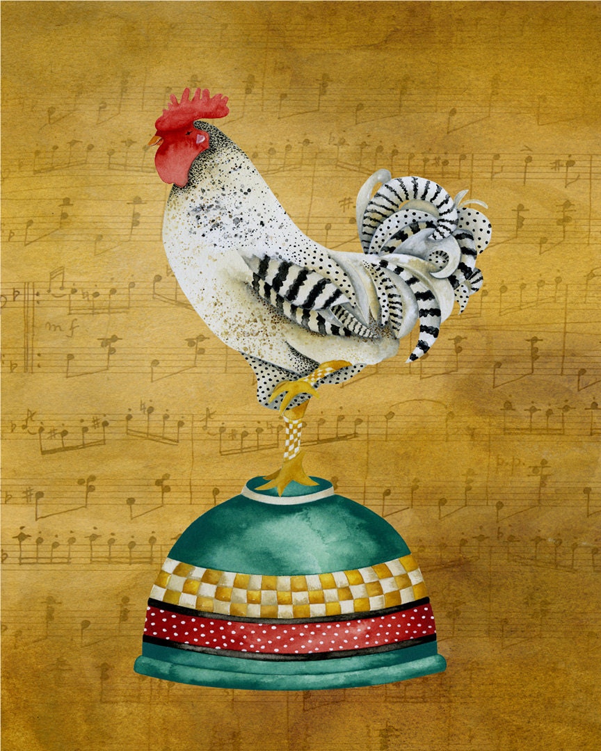
8 x 10 Art Print. Musical Rooster On Baking Bowl
by studiopetite2
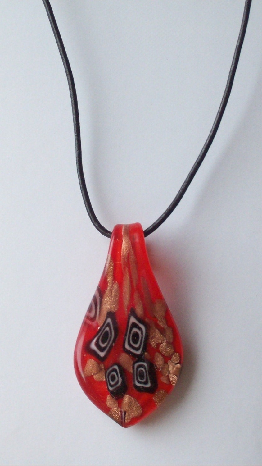
I notice it most often with necklaces, and it's tragic because the bottom of the necklace is usually the most important part!
 May 15th, 2012 - featured
Red Teardrop Glass Pendant Necklace, Red Necklace
by Michelleshandcrafted
 May 15th, 2012 - 86th place
Victorian pendant necklace - romantic - red rose beads - gold chain
by maybesparrowsjewelry
My advice: for your first photo, don't ever turn the camera to portrait orientation. Make yourself capture the whole item in your camera's viewfinder without turning it. Make sure none of the edges hit the sides of the thumbnail, because it looks messy.
And every so often, look at your shop in both views, and ask yourself if you're happy with what's being seen. Most users won't see anything more than that.

No comments:
Post a Comment